Basecamp
Brand Strategy, Brand Identity, Web Design
Basecamp is a SIDEIM Fellowship designed to gather, recharge, educate, and mobilize a community of Institutional DEI leaders.
A basecamp is a place to rest and prepare before, during and after a long and strenuous journey, often in large mountains.
The path to the institutions they envision is long, arduous and steep. We all need a place to rest, connect, and prepare for the intellectual, emotional, and spiritual preparation and sustenance needed for the leadership journey ahead.
THE CHALLENGE
Basecamp was created in response to the founders’ experiences as DEI leaders in corporate settings. Training and resources available to DEI professionals were meager to nonexistent. There were few models available for best practices. The (often white, male) C-suite executives didn’t understand or care about the work. Thus, a common experience of these leaders is poor support, overwork, overcommitment, burnout and high turnover.
How do we brand & position a fellowship that is supportive, empowering & caring of taken-for-granted BIPOC leaders?
We began our project by defining some guiding principles of the Fellowship:
Transformation
Journey
Wellness
Nurturation
Matriarchy
Authoritative
Luxury
Human
Nature
Organic
Next, rather than carrying out a competitive review (as there were no competitors at the time), we defined our operating space as
LUXURY HOSPITALITY
This is a rather radical position, as the existing industry presents as a dry, corporate afterthought. We are placing a stake in the ground to say we matter and we deserve what the rest of the C-suite has always received.


We then created a logo that is rich with meaning
Mountain Landscape
The basis of our brand promise & story.
A Journey
The landscape in the icon is composed of one continuous line, depicting the personal and professional path of growth & transformation.
A Portal
The fellowship is both a portal in that the retreat is a uniquely nurturing and transformative space, and that the professional development offered is a portal for the advancement of SIDEIM work industry-wide.
A Crown
Though SIDEIM is a nascent field, our people and our work has been treated & seen as unneccessary, disposable, superficial. We believe it is imperative and fundamental - every SIDEIM leader and BIPOC employee to be treated as royalty.
Many Facets
The icon evokes a gemstone, a precious natural material honed by the human hand. This calls in the intersectional nature of our offerings, the multiplicity of skills required of SIDEIM work, and the diversity of folks included and impacted by the fellowship.
Shelter
The portal also leads to shelter at the base of the mountains. To rest, recuperate, revive and invigorate.
Multidirectionality
A journey of growth and transformation does not move in a straight line, but often in all directions.
Elegance
Bascamp is a luxury offering, in line with the established expectations of other C-Suite development opportunities. In addition to the extensive meaning infused in our icon, it reads instantly as simple, elegant and luxurious.

Building upon these visual and conceptual themes, we created a number of tools & devices to be used across the brand, including:
A set of icons
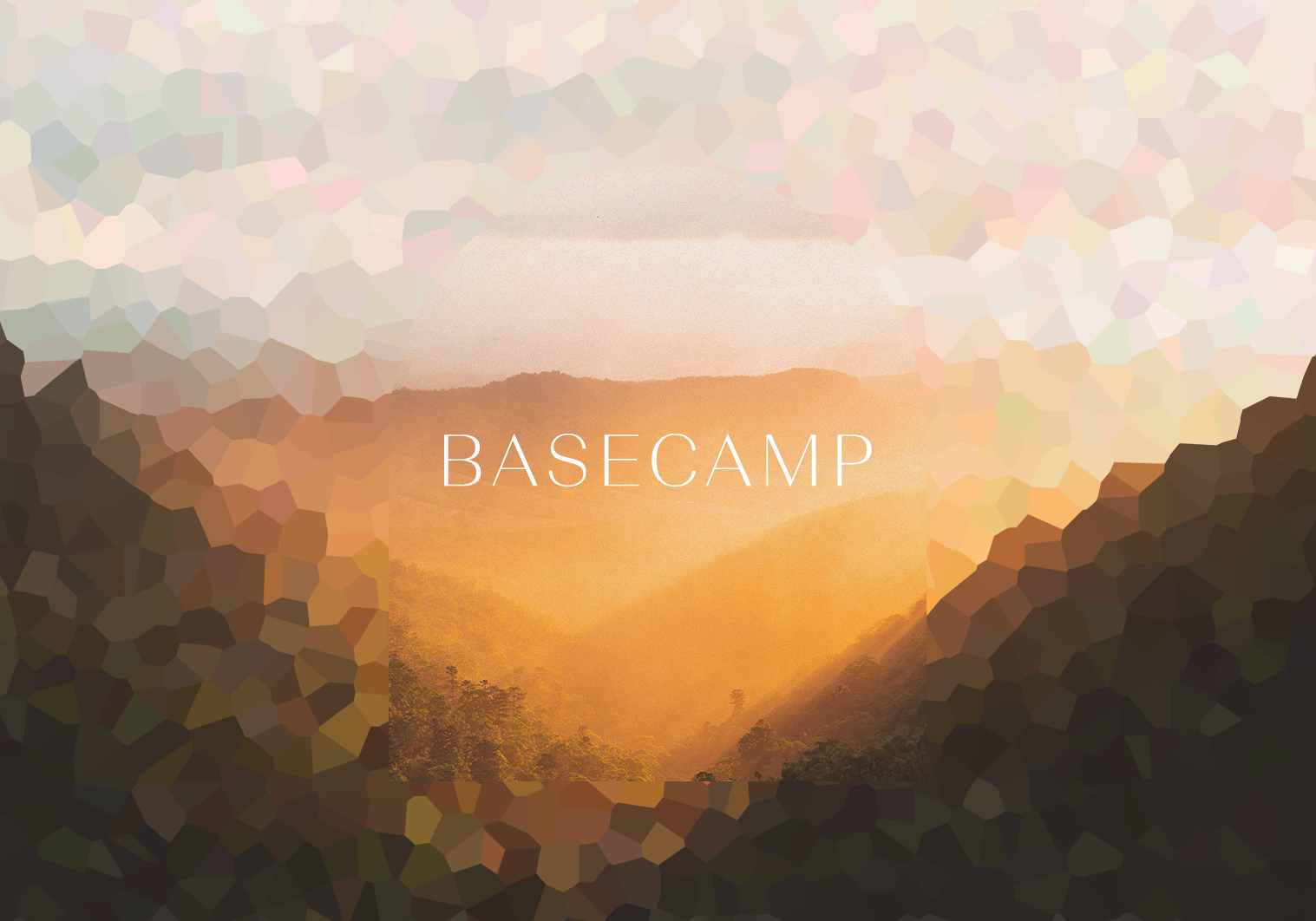
The Portal device
A portal is a locus of transformation and transport. In the sci-fi reading, a literal, physical jump in time and space. Historically, the arch is an architectural feature used for much of human history. Endowed with the ability to bear tremendous weights while also having an unparalleled aesthetic beauty. Basecamp is a portal of transformation for DEI professionals.

The Mosaic Effect
We created an effect to abstract our images. This reflects the theme of community & facets from our icon. It also brings forward the theme of focus and clarity. SIDEIM work is mired in obfuscation from all angles. This effect helps communicate that while this work can be muddy and scattered, there is both community in this work, and Basecamp is here to provide focus & clarity.
The mosaic effect can be dialed up or down, depending on the application.

Photography: subject, style & perspective

We defined an image strategy of using powerful portraits of professional women alongside landscape photography in both macro and micro perspectives. We also created a treatment that is applied to all images to unify them under the Basecamp aesthetic.
All of which come together to comprise a system that can be deployed both consistently and dynamically.


IN THEIR WORDS
“We were simply blown away by the way Andrew was able to both articulate our mission and demonstrate the strategic alignment between his artistic choices and the user experience we want our customers to have.
It’s hard to find creative partners who bring together such profound technical and artistic abilities. Andrew is a storyteller-- a deep listener and talented co-creator. Andrew’s style of engagement and deeply intentional curatorial choices with his craft made him indispensable.”
- Theodosia & Brian Cook, Founders of Basecamp