fontinalis
Brand Identity
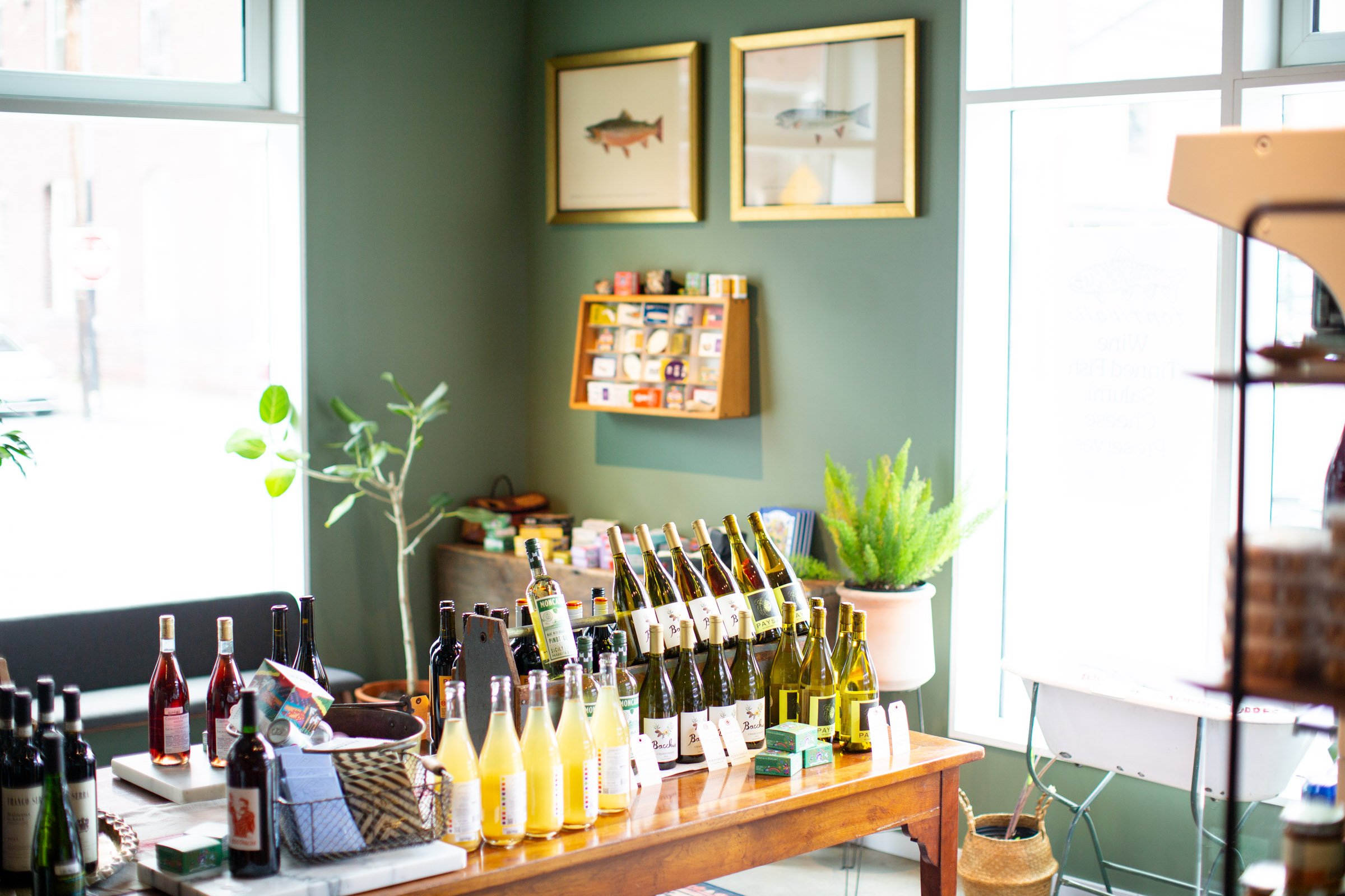
Fontinalis is a wine shop that carries products made with the health of humankind in mind. The shop’s namesake is the species name of the brook trout (Salveinelus fontinalis). They are endemic to Vermont, and an indicator species of the ecological health of their ecosystem. Brook trout are found in the most clear waters in the region.
The owner of the shop, an avid fly fisherman and outdoorsman, brought a vision of your measure-once-cut-twice grandfather’s fishing lodge deep in the mountains, replete with ancient leather wingback, pump well and wood burning stove. We sought to bring the nostalgia without the misogyny, modernizing the edges and accents without losing the grit and callouses. Craft, care and reverence for the natural world are at the center of the vision & vibe.
Our process began with a survey of historic art and literature about trout and trout fishing.
Which led us to a collection of stunning zoological illustrations of the brook trout in their 4 life stages.
While the illustrations are beautiful, what became more interesting was the handwriting of the artist. Noting the details and location of the fish, the handwriting is idiosyncratic and written with care. An emblem of a time when craft was embedded in the smallest details.
In particular, this version of the species name carries a compelling, inexplicably capitalized T in the middle of the word:
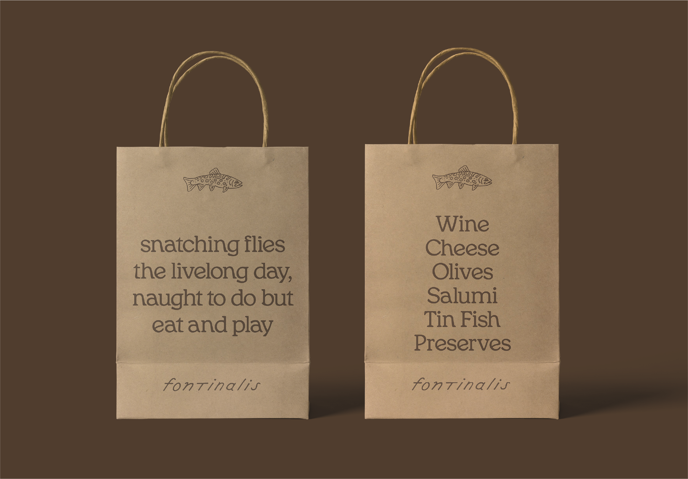
So we drew a custom logotype based on this handwriting, carrying forward the story, idiosyncrasy and hand-madeness,
We then explored a number of directions for an icon to accompany the logotype,
settling on a hand-drawn brookie with a balance of traditional and playful vibrations.
In the course of our initial research, we found this terribly charming poem, wherein Charles Hallock expresses his love for the Brook Trout.
We thought the concluding lines are an apt representation of the connection between fly fishing and consuming delicious wine and snacks.
So we borrowed it to use as a tagline & key message.


