Curly Girl
Brand Identity, Packaging, Website
Curly Girl is a latinx-owned food brand that blends founder Arealles’ Puerto Rican heritage with her Vermont upbringing.
We rebranded Curly Girl to set up her popsicle business for growth, and to introduce the catering side of the business, Taíno Kitchen.
Furthermore, her existing logo had been sourced from an online generator. Which is, of course, fine, and afforded ample room for improvement.
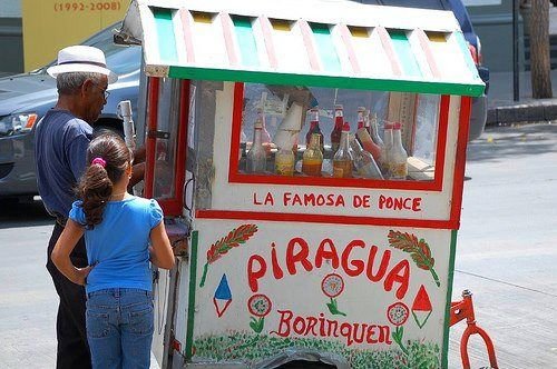
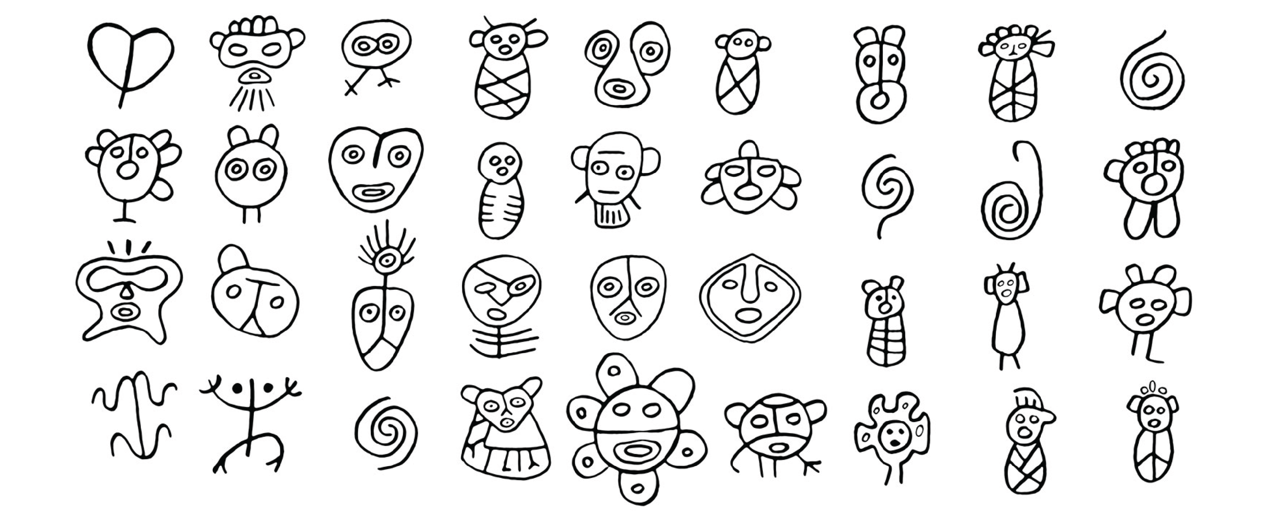
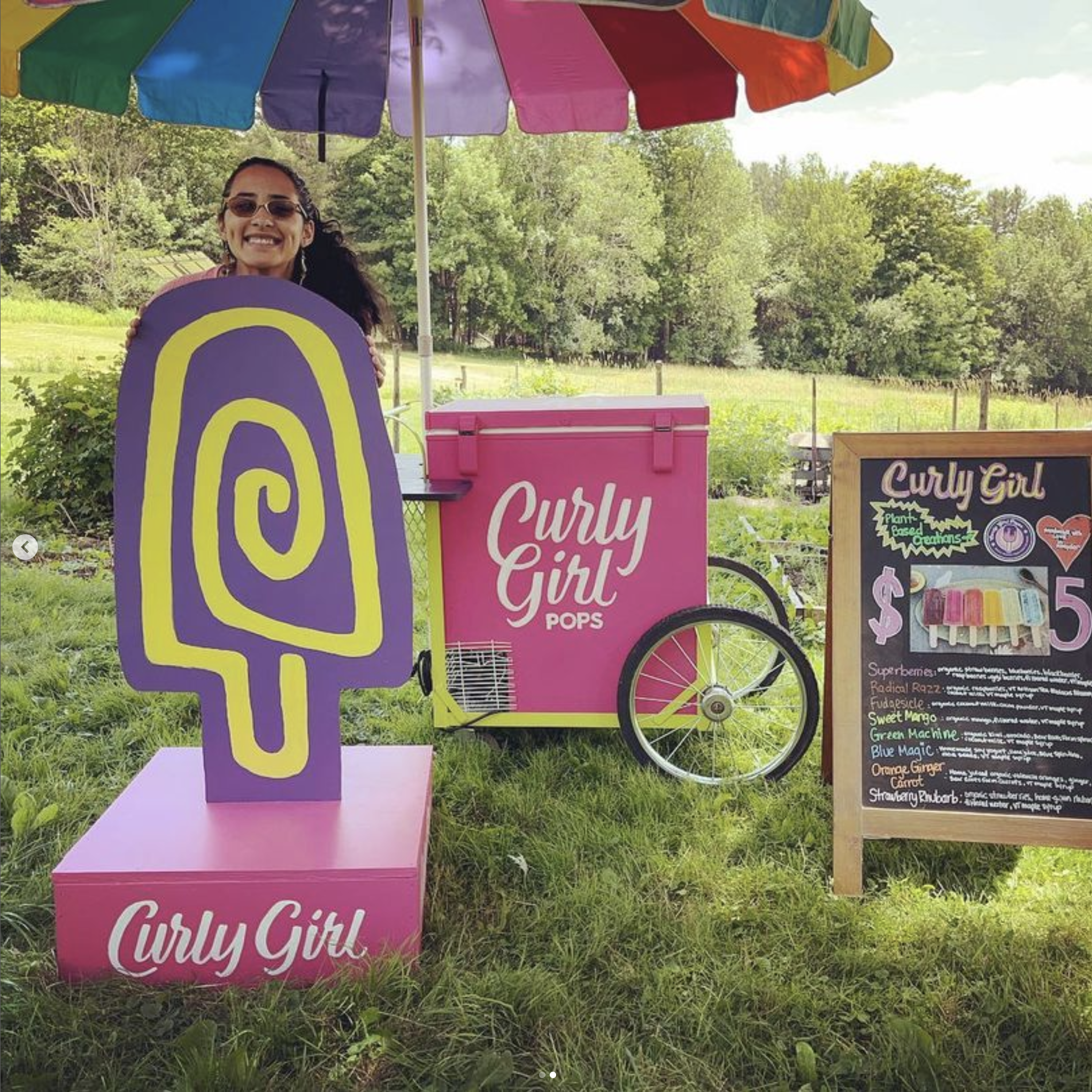
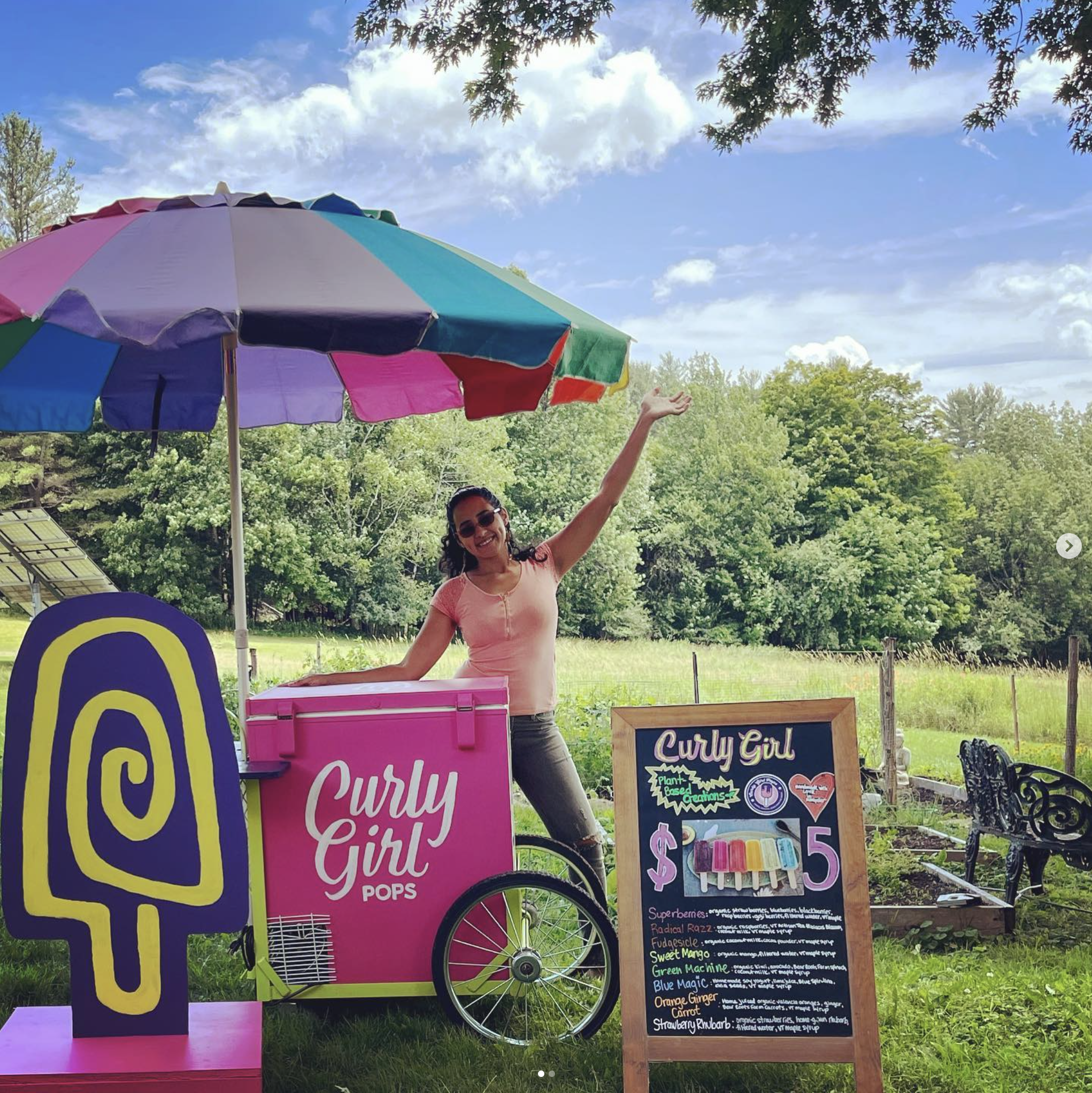
We began the process with an exploration of Arealles’ inspiration: piragua carts, the vibrant colors of San Juan, and Taíno petroglyphs
Our conclusion was that we would pursue a solution that is colorful, joyous, boricua and handmade.

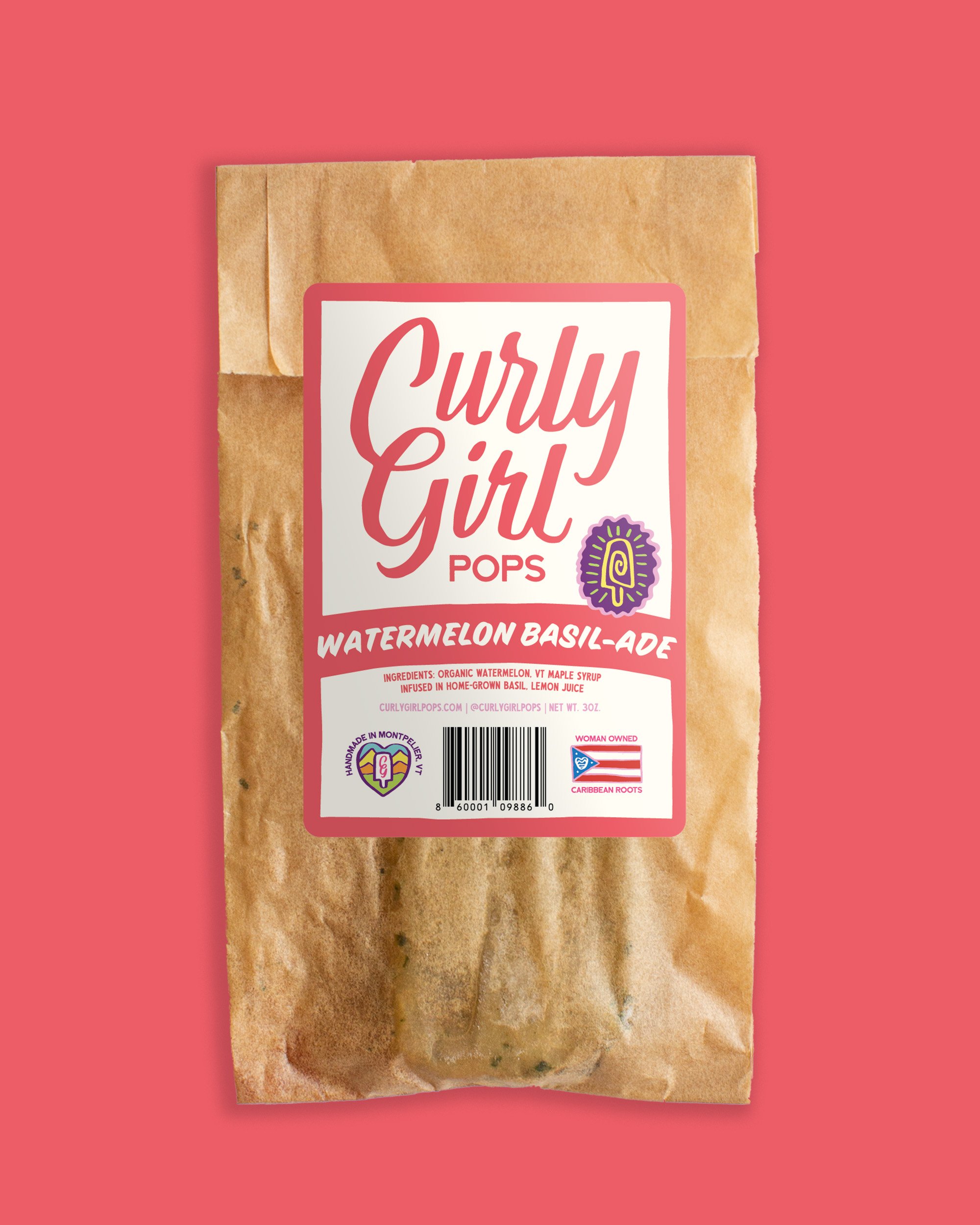
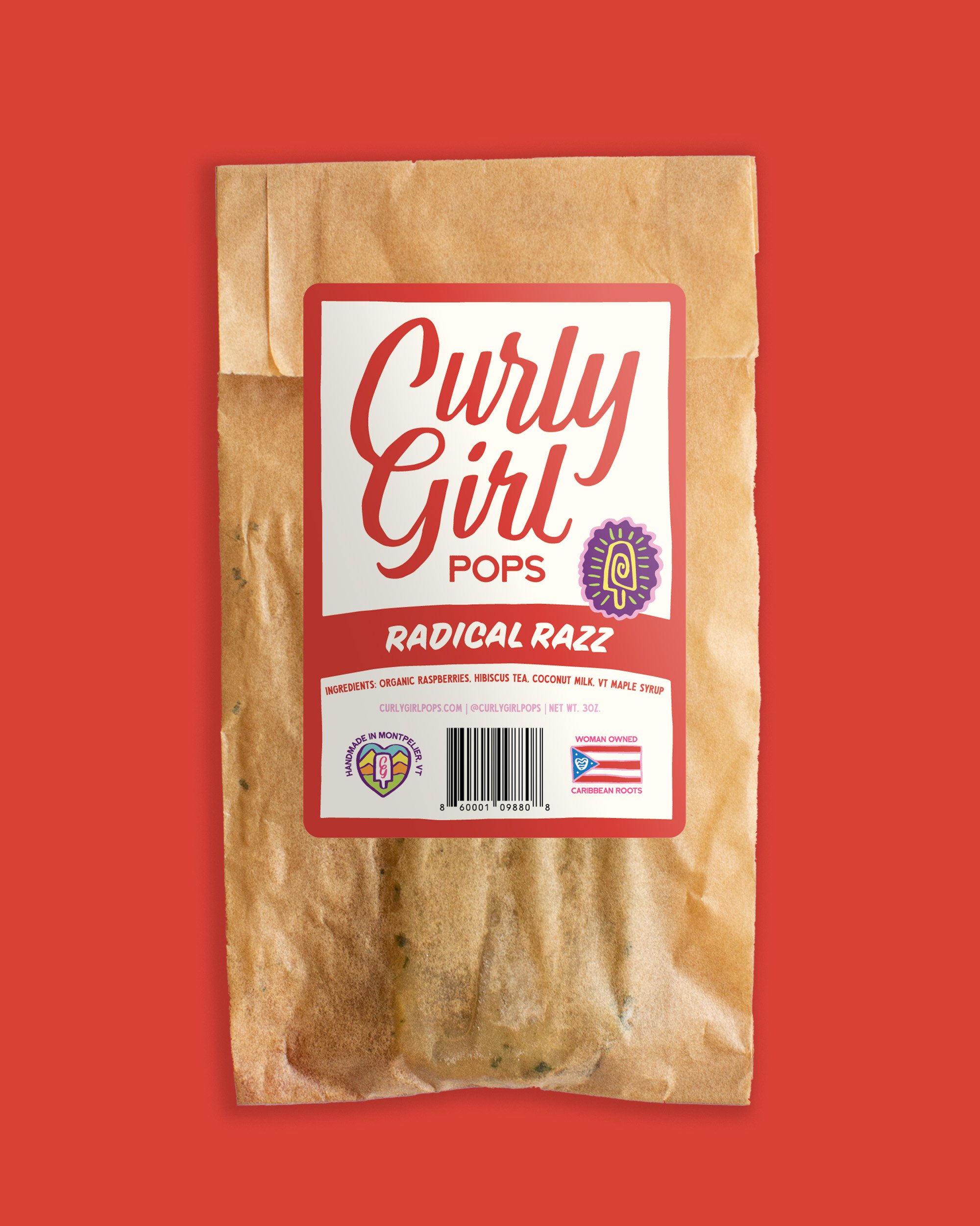
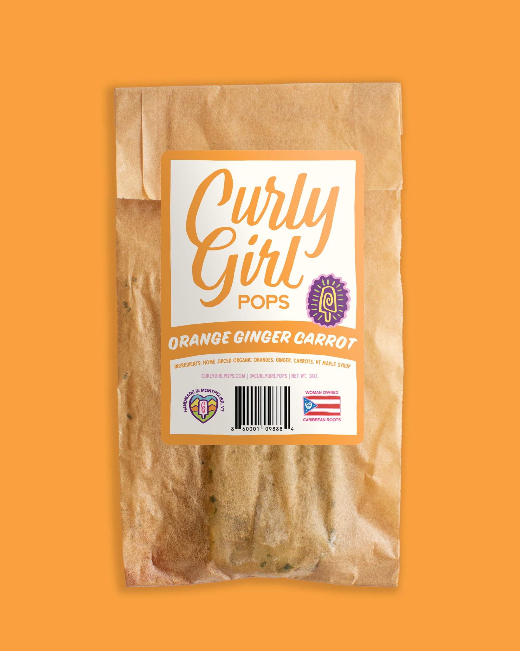
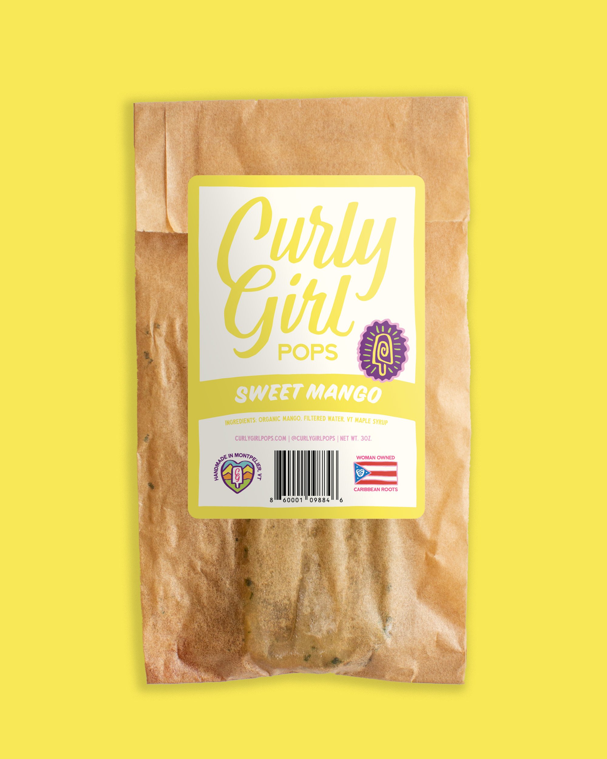
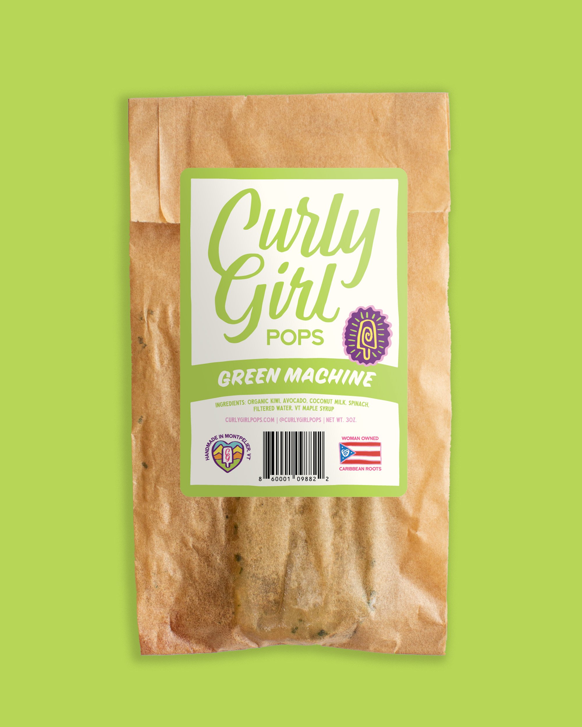
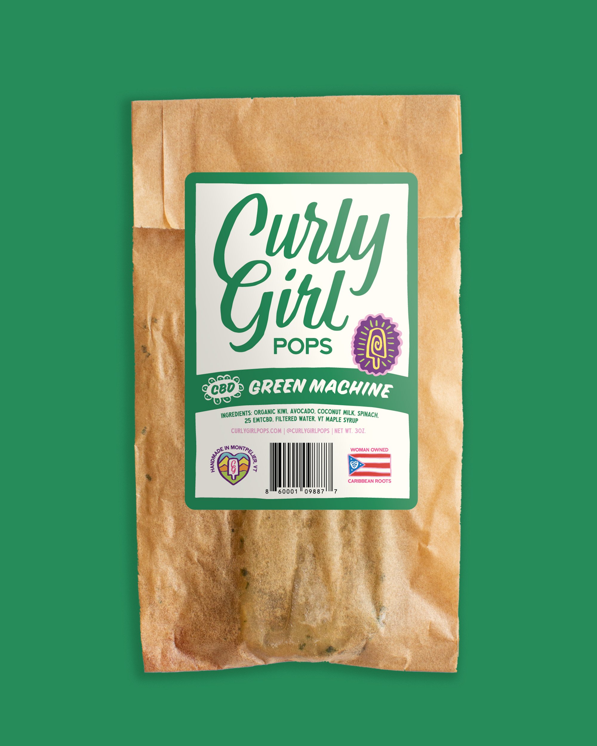
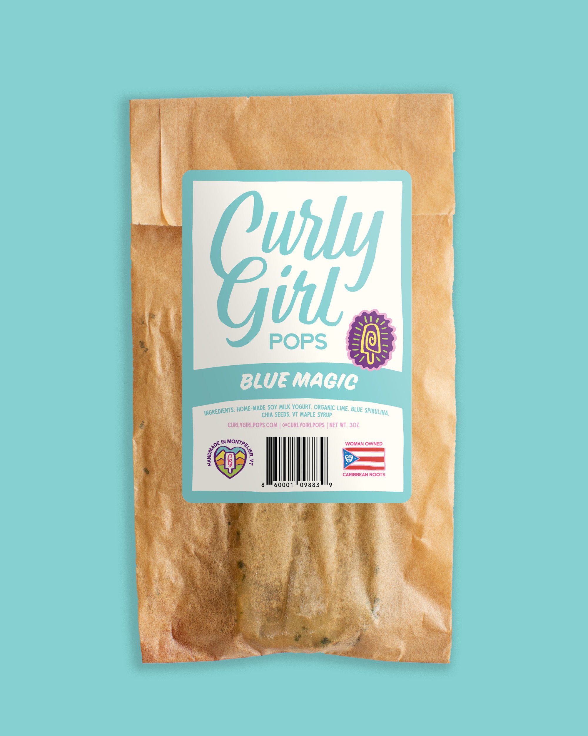
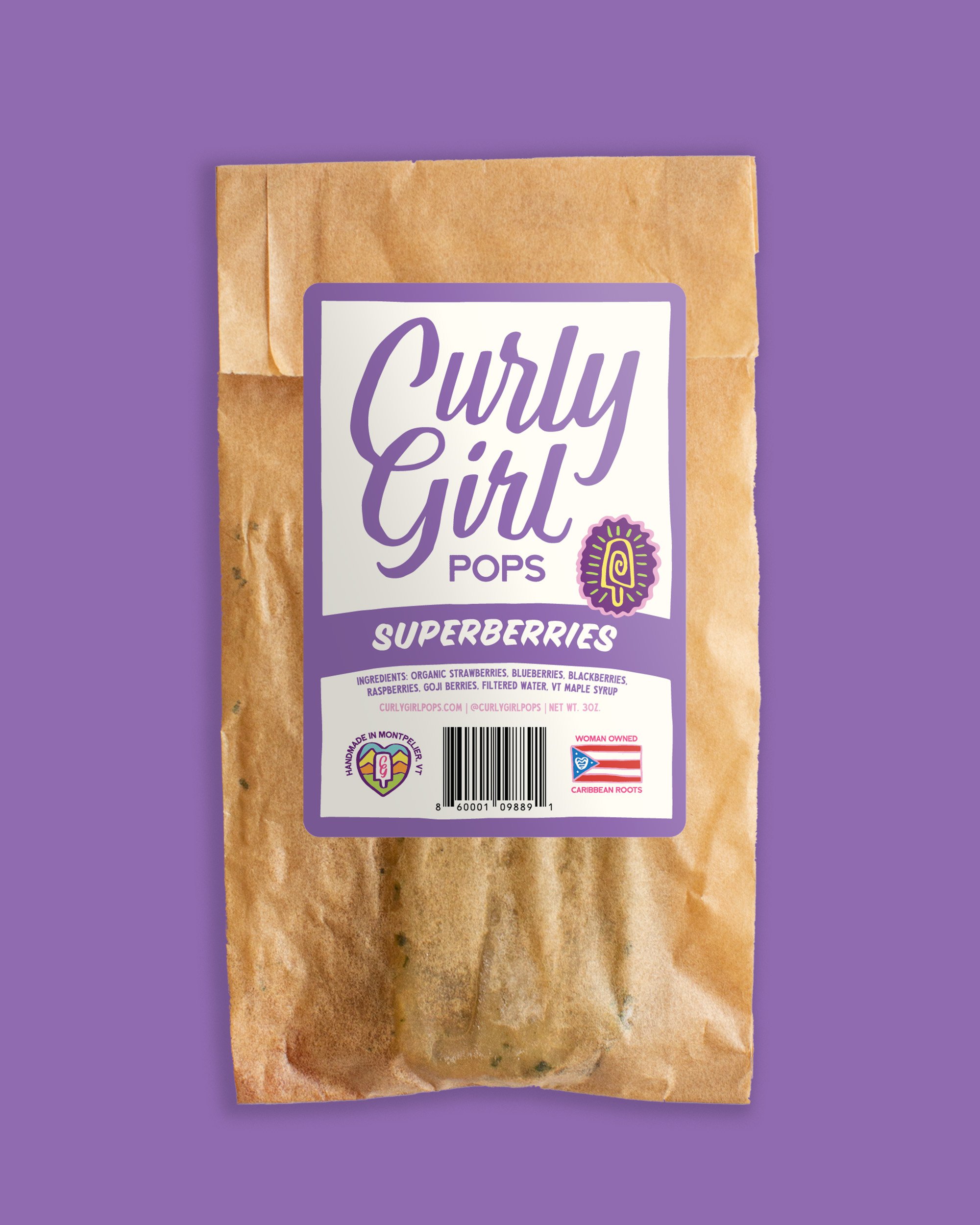
Our first move was to creat a custom, hand-drawn logotype.
If you look closely, you’ll notice there is a curl connecting the C and the G.

Next, we had to reckon with the brand architecture.
Previously, we were just Curly Girl Pops. Now, we have Pops and Taíno Kitchen.
Are they part of the same brand? Divergent but unified? Synergized? Differentified?? These are the questions that separate the chaff from the riff raff.

We defined Curly Girl as a parent brand, with Pops and Taíno Kitchen as the two main offerings.

To develop icons, we built upon the style of Arealles’ ancestors’ petroglyphs,
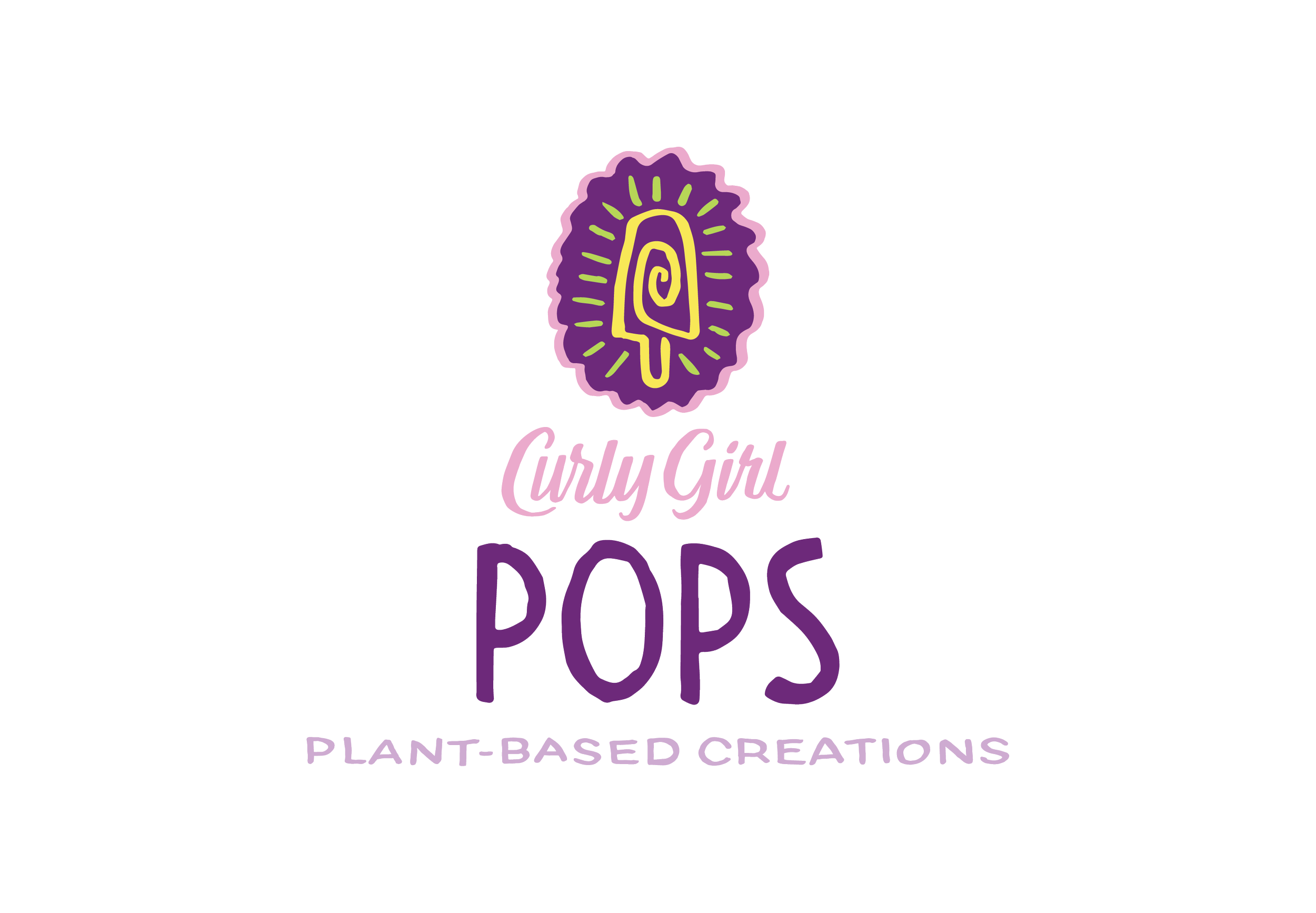
and created an icon for each offering.

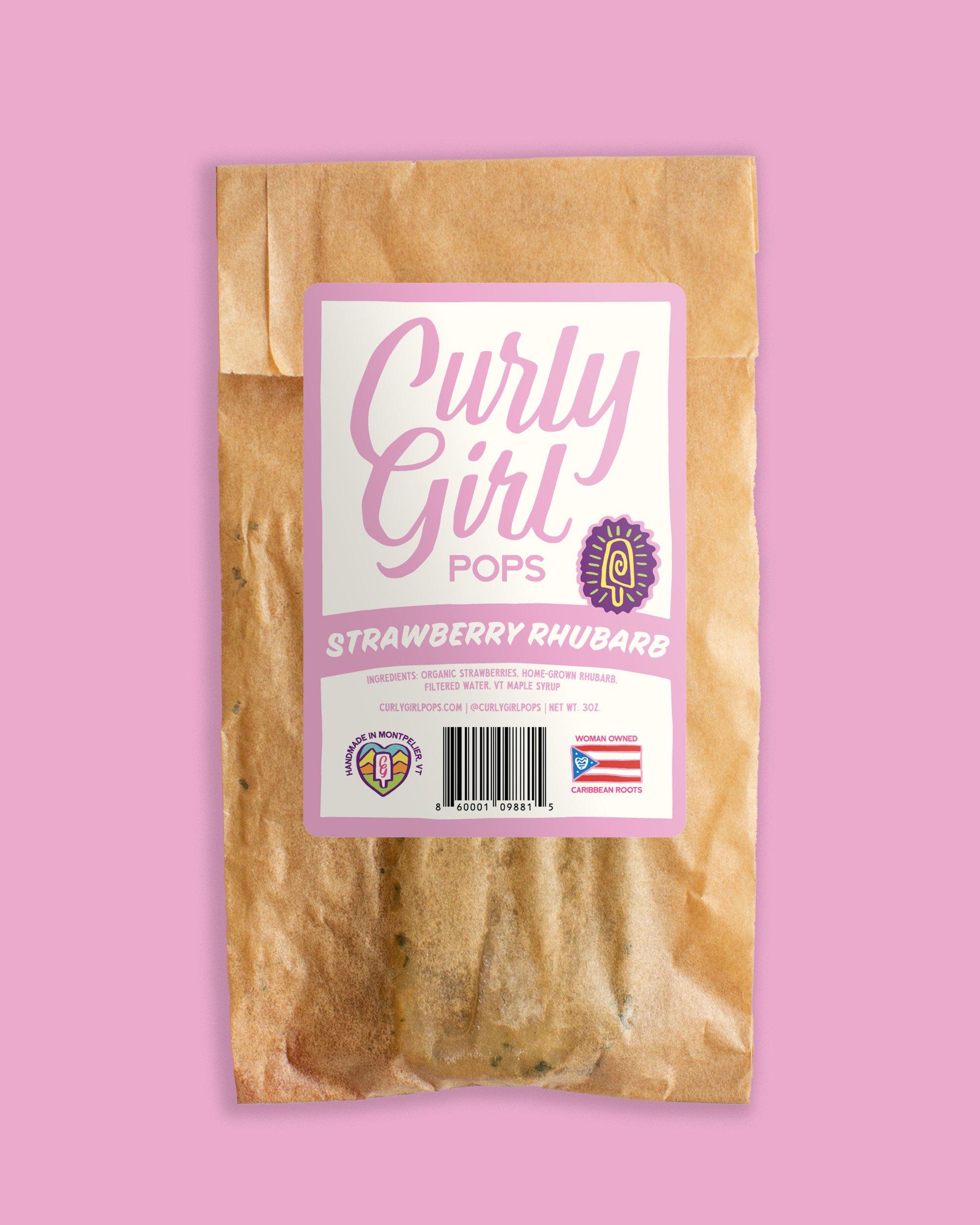
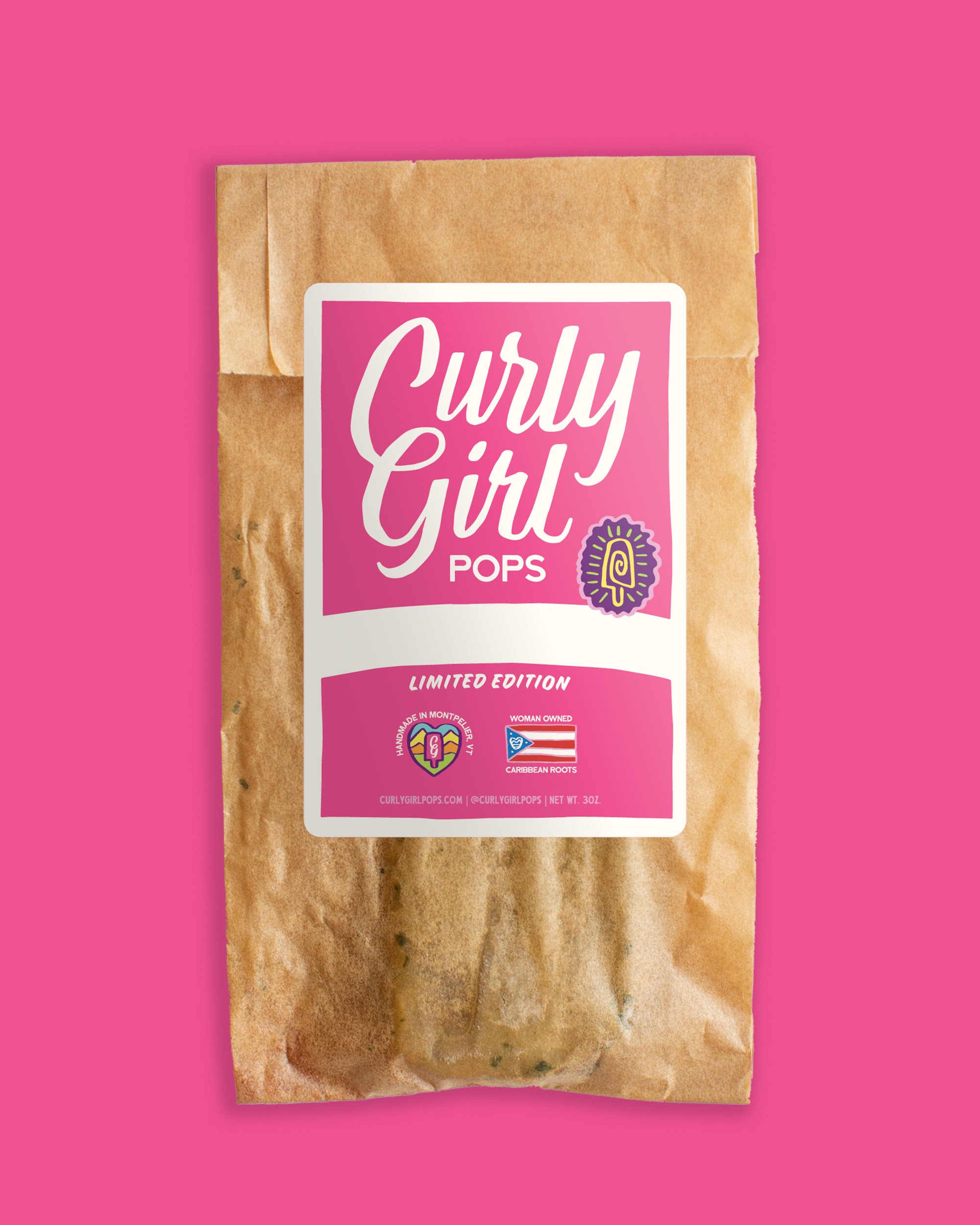
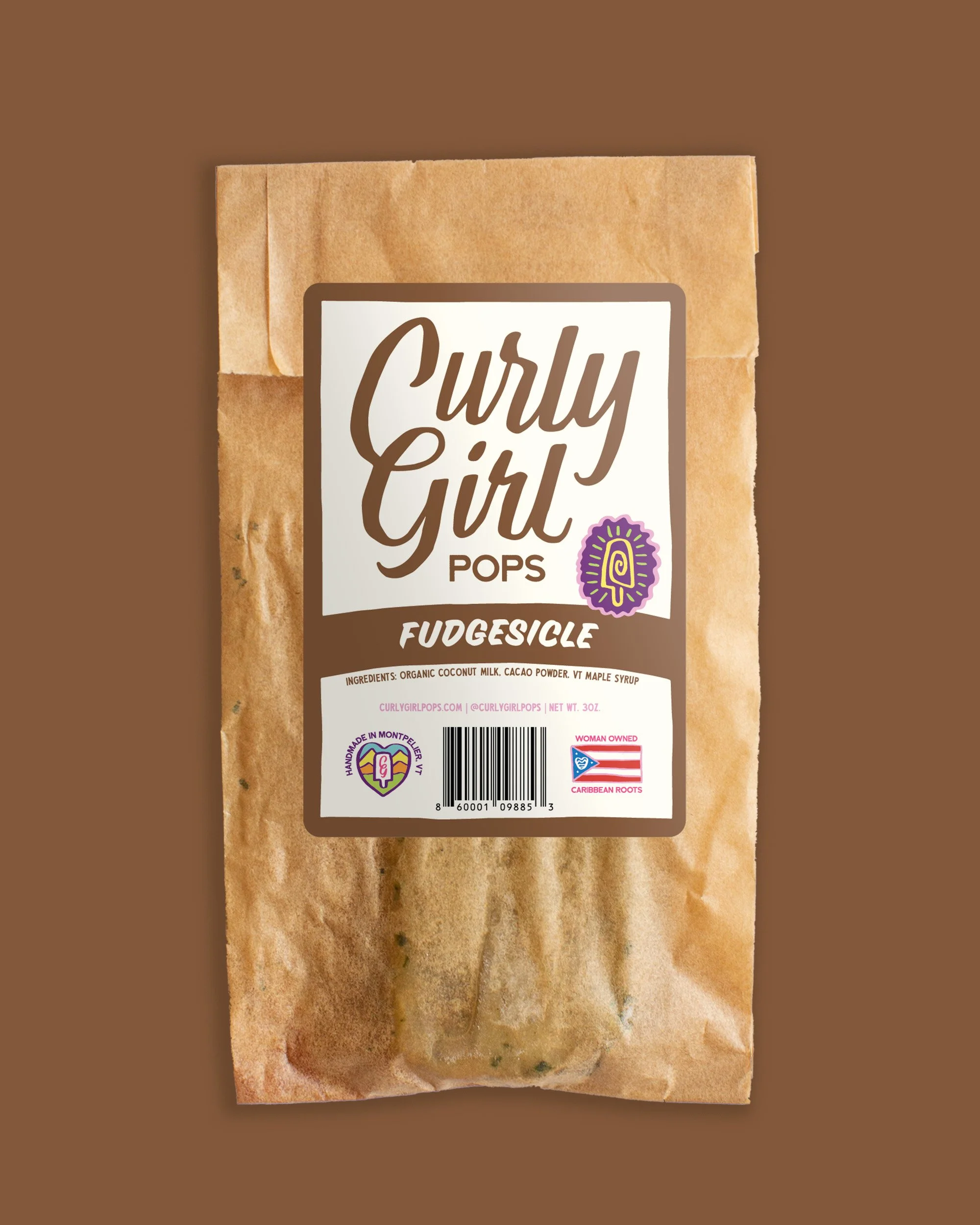
We then put it all together
Including some more jazzy secondary lockups
If you put these under the microscope, you’ll notice they are in the shape of a pop and a plate, respectively, adding depth, and sprinkling a resultant impactful delight when an unsuspecting patron notices.

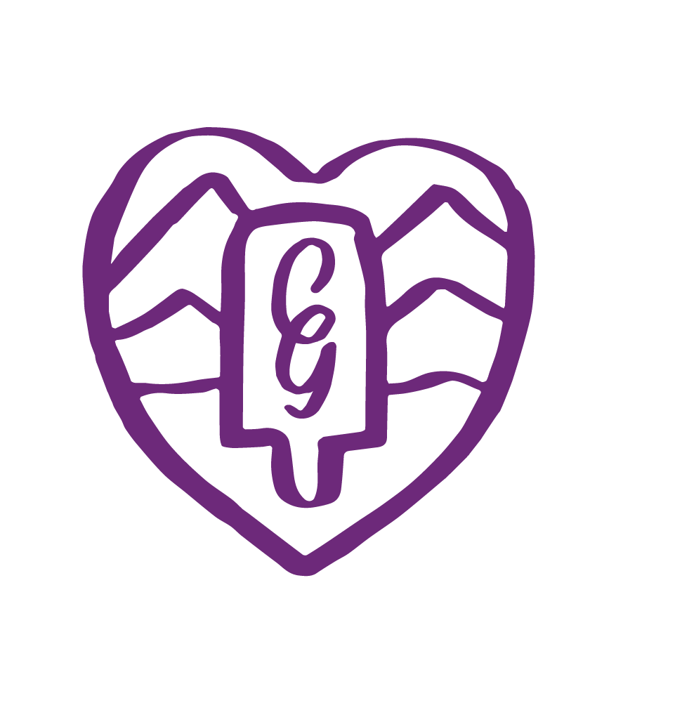
Since we couldn’t stop and wouldn’t stop, we then created secondary marks for each entity,
The Pops secondary mark is a pop take on the coat of arms of Vermont.
Speaking of which, if you work for the government office of seals and badges, please call me.
and defined the illustration style that can be used to create subsequent supporting marks and icons.
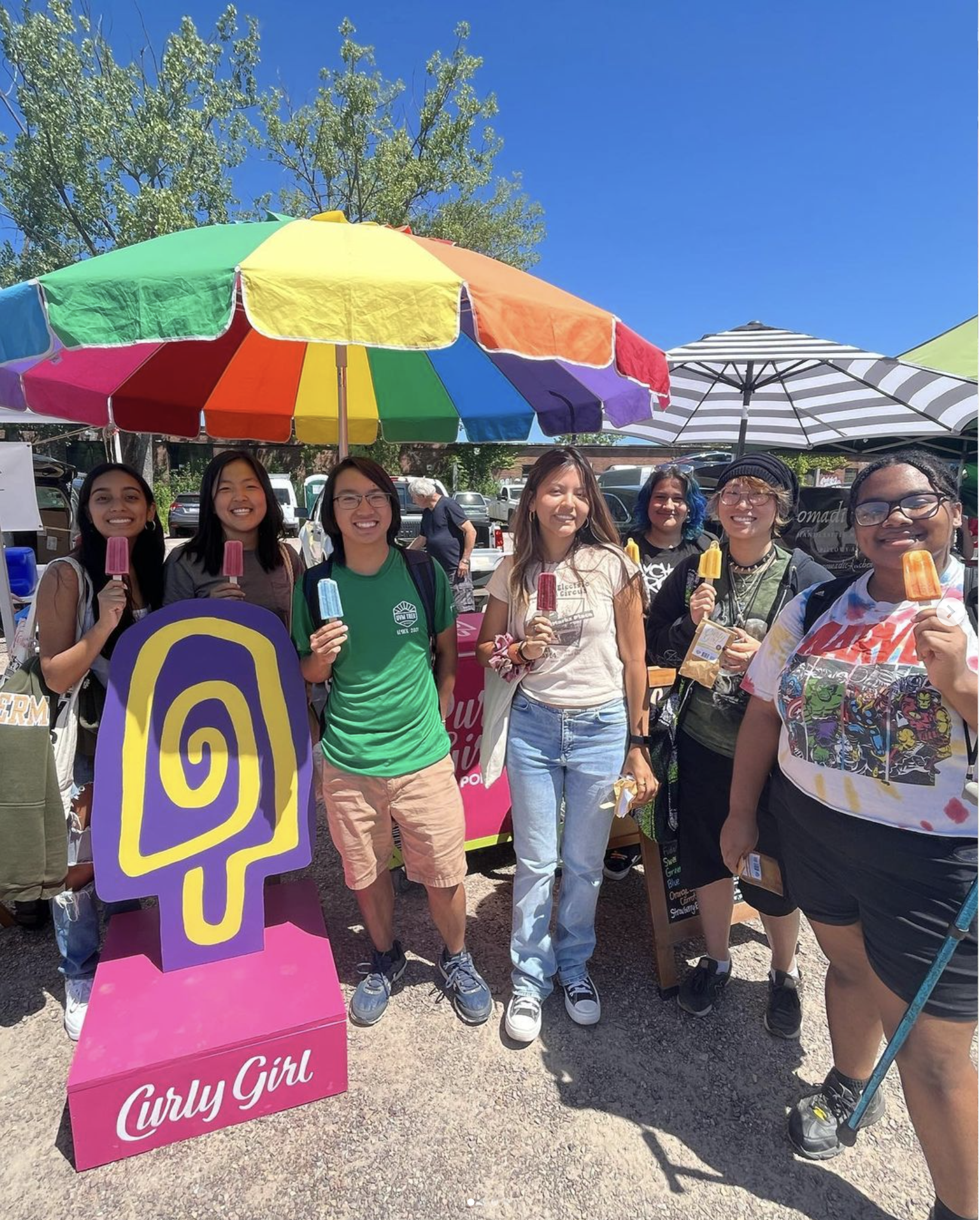
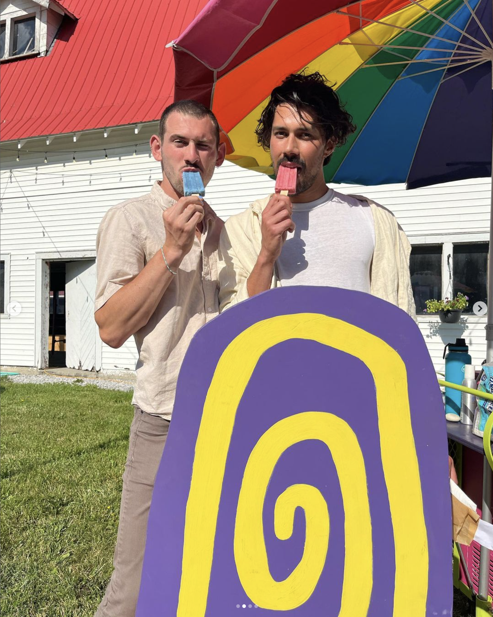
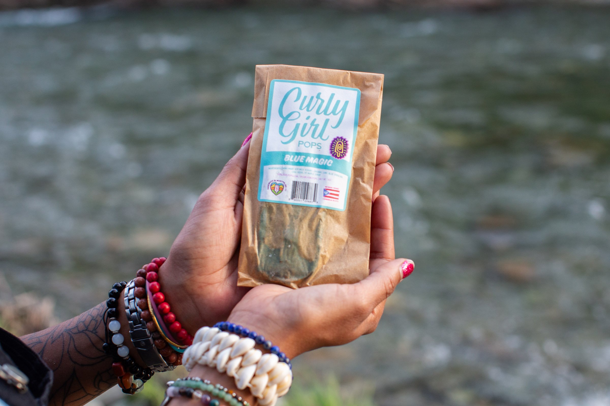
Finally, we brought it all to life


