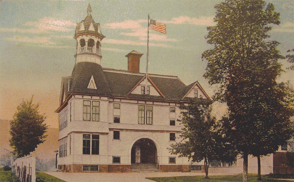
Maverick Lloyd School for the Environment at the Vermont Law & Graduate School
Brand Strategy, Brand Identity, Photography
We worked with the office of the dean of the MLSE to develop a comprehensive strategy, messaging framework and brand identity for the school during a restructuring of the VLGS institution.
Formerly, the Vermont Law School (VLS) was a law school that offered graduate degrees. They re-organized the institution and renamed as the Vermont Law & Graduate School (VLGS), with three unique schools: the Law School, the Graduate School and the School for the Environment (also a graduate school). Each school shares curriculae, programming, clinics and resources, but is a distinct entity. Upon renaming, VLGS developed a brand identity for the institution, but did not extend into the individual schools. Sound a little chaotic? Sure was.
THE CONTEXT
The School for the Environment engaged us to develop a brand strategy that would illuminate how unique the school’s offerings are in a limited landscape of environmental graduate schools, set it apart from the competition, and develop a brand identity that would be unique, recognizable, and fit within the framework of the identity created for the VLGS institution the year prior.
THE CHALLENGE
Upon re-organization, there was widespread institutional uncertainty. We were brought on to create clear messaging and branding for the School for the Environment.
THE SHORT VERSION
Challenge #1: The Puzzle
When the institution renamed, they also rebranded, updating the institution’s logo. Upon re-organizing, they introduced three schools within the institution: the Law School, the Graduate School and the Maverick Lloyd School for the Environment.
If you look closely, you’ll notice that one of these schools is not included in the new logo.
Thus, one of our organizing challenges: how do we create an identity for the MLSE that is unified with the institution branding, and unique to the MLSE?
Challenge #2: Platitudes Galore
In the limited competitive landscape of other respected Schools for the Environment, we determined it is quite difficult to say anything without falling into well worn platitudinous paths.
Thus, how do we communicate our value and our values without using the same old stale language that everyone else is using?
DEVELOPING A BRAND STRATEGY
A brand strategy is an encompassing conceptual foundation of your brand. The following are the building blocks of the strategy we built out for MLSE.
Defining a meaningful Position is key, as everything flows from this organizing idea. Your position is your essence, your raison dêtre, your why, who you are & what you do, how you relate to your competition and how you want your audience to think about you. And ideally, it’s snappy.
To develop an apt position, we began by diving deep and immersing ourselves to the gills in the VLGS story.
Vermont Law School was founded in 1972, and in the ensuing decades earned a reputation as a pioneer in both environmental law and environmental higher education.
Their history as a top environmental law & graduate school and their range of programming & degrees authentically sets them apart.
But that’s what everyone says.
Next, we looked at their students, and identified the some key qualities that they bring to school:
They are smart, self-motivated and understand the magnitude of the work. They are ready for the fight, looking for a challenge, and have high expectations of themselves and of the world they hope to affect.
Overwhelmingly, they are passionate and ready to make change.
But that’s what everyone says.
Our position is passion.
Passion is what sets us apart. Yet, Passion has been scientifically proven to be the most cliché Thing. So, we found a more compelling trajectory:
FIRE
Fire captures the essence of Passion, and brings a dynamic opportunity from which to build a story. Fire is unexpected. Fire is controversial. Fire is primal. Fire is powerful. Fire is compelling.
Some of the nested ideas embedded within this foundation are:
Passion
Our core principle
Spark
Excitement, Instigation
Light Your Fire
Motivation
Shine Bright
Inspiration
The World Is Burning
Climate Change
Fight Fire With Fire
Our Method
Light a Fire Under Your Ass
Urgency
Phoenix Must Burn to Emerge
Hope in hard times
Countercultural
Unexpected/Reframing the Negative
Sexy
Broad Appeal
Having defined a foundation for our position, we then developed a positioning statement:
BURN BRIGHT, SHAPE CHANGE
Burn Bright
Captures the Fire
Depicts Passion
Beacon of light in dark times
Torch leads the way
Bright leaders
Shape Change
Softer than typical, militarized language
More honest about possibility of change
Change is neither good nor bad, but up to the values of the shaper.
Nod to Octavia Butler, and her radical vision of new worlds
To shape Change, shape yourself
As a positioning statement is typically for internal use, we then created a tagline that would bring this position to life:
Stoke Your Fire evokes the feeling of being inspired. It is focused on the student (rather than an amorphous & generic end), and acknowledges that their fire is already lit, embers alight, passion ablaze.
We then developed a mission statement, vision statement, values statement, a manifesto, a brand story and a full suite of key messages, replete with a copy library to pull from, including excellent examples of fire metaphors to deploy 🔥
Since this case study is already ridiculously wordy, we’ll spare you the pain of including all that here, and just share the manifesto. Because manifestos are cool, y’know?
The MLSE Manifesto
The world is burning. We must reverse the course of climate change, accept that racial justice is climate justice, and foster a sense of hope in this uphill battle.
We are building a culture of passion, urgency and professionalism to empower a new generation of policymakers to enter the halls of power, shake things up, and shape change, for good.
Developing A Brand Identity
Our next challenge was to create a brand identity, based on this strategic work, that was both unique and aligned with the VLGS parent branding.
So we took the VLGS logo,
lit the torch,
and brought it forward.
Next, we developed several secondary marks:
A monogram, in the style of the VLGS stenciled logo mark.
A shield with a flamey bottom.
and an evolution of the school’s swan crest, depicting a phoenix (the most fiery bird out there).
Finally, we created a number of lockups for dynamic deployment:
Photography
Next, we created images that align with the strategic vision for the brand, beginning with creating a studio with dappled, forest light, to maximize the environmentalism.
We also created images around campus
Bringing it to life
Finally, we put all the pieces together:


